


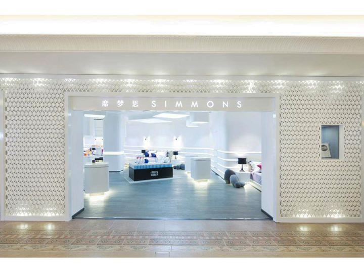
Simmons Asia, Next Generation Of Shops And Rebranding (Premier & Studio Shop)
We were commissioned for the re-branding for Simmons Asia’s shops, uniform and corporate identity. This is a challenging task: how can we represent a bedding company with such long history? Thus, we have first conducted a three months research on Simmons, and their competitors.
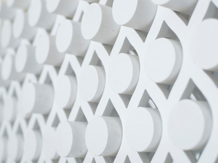
After the research period, we have realized that a minimal shop, will be able to accentuate the presence of the beds and the products, it will differentiate Simmons’s shop from the competitors. The circulation of the customers and the experience is our main focus: A minimal, pristine and perennial space will allow Simmons’s customers to linger and try the beds freely. A barrier free shop will allow Simmons’s staffs to may remain eye contact with the customers and to offer assistance to them anytime.
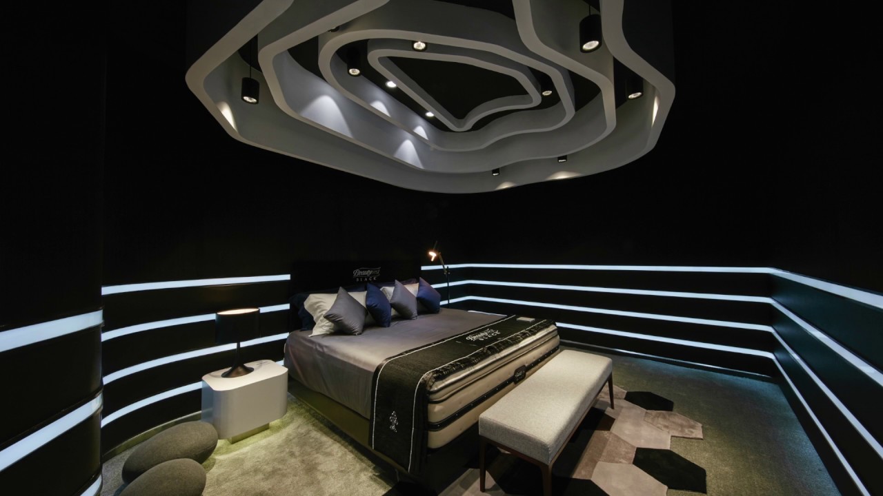
The sound, water, rain drops, the color blue, our clean uniform design and other embellishments; these are all devised to provoke the five senses of Simmons’s customers; reminding them the importance of a good rest at night. The bed and the bedroom shall be a sanctuary for Simmons’s customers to re-charge and to refresh.
GROUNDWORK TEAM Manfred Yuen, CY Lau, Lawrence Law, Echo Xiang, Krystal Lung
GRAPHIC DESIGN Edwin Lo
LOGO DESIGN /BEDDING / UNIFORM DESIGN AND SELECTION Manfred Yuen, CY Lau, Lawrence Law, Echo Xiang, Krystal Lung
PHOTOGRAPHER South Ho
YEAR 2015
LOCATION Greater China region
CLIENT Simmons Bedding International
STAGE 100 outlets completed by 2017